
A good window treatment shouldn’t shout for attention. It should frame the light, soften the room, and hold its appeal long after trends shift. That’s one reason many homeowners gravitate toward shutters—their clean lines and sturdy build tend to outlast fabric fashions or fragile blinds. When I went through the process myself, I realised the choice wasn’t just about style but about how the shutters worked with the bones of the house. That’s where custom window coverings made sense. Instead of squeezing a standard frame into an opening and hoping it fit, the shutters were measured and shaped to suit the actual windows. The result felt built-in rather than added on, and the room carried a quieter, more timeless look. It’s that sense of integration—where the shutters feel part of the wall—that gives them staying power in a space.
What makes indoor shutters feel timeless
Timeless isn’t code for bland. It’s balance: proportion, tone, and how the shutters meet the wall. I learnt this the hard way with a narrow hallway window where thick frames made the opening look pinched. A lighter profile changed the feel instantly—same wall colour, new sense of space. Think in terms of how the shutters “read” from across the room and how they carry the eye around the space.
Match frame depth to architraves so lines stay continuous and clean.
Use slat widths that suit room scale: wider in open living, slimmer in compact studies.
Keep colours close to white or trim tones for a calm, built-in appearance.
Prioritise smooth operation over unusual shapes unless that shape solves a real need.
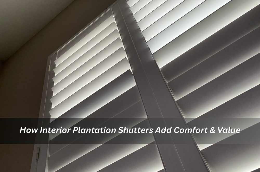
I also like to test drive the light. Open the panels, tilt the slats, then stand at different points in the room. If the light pool on the floor feels even and you’re not squinting at the reflection off screens, you’re in the right zone.
Designing for light, airflow and safe daily use
Daylight is why shutters shine. You can feather slats to cut glare without blacking out the room, and the panels themselves can hinge wide on breezy days. In family zones, I pay attention to how nearby furnishings, cords from other treatments, and doorways interact with moving panels. It’s less about fuss and more about making sure everything works without a second thought.
When you’re planning layout and hardware, it helps to consider safety standards for openings and fittings. A practical way to bake that into your plan is to align your detailing with plantation shutters interior design Australia guidance on blinds, curtains and window fittings—especially in rooms where kids roam or where furniture sits close to windows. I’ve found that thinking about reach, finger clearances and how slats move near jambs prevents little frustrations later, like panels clipping handles or catching on nearby shelving.
Map swing paths for panels so they don’t collide with furniture or door hardware.
Choose hinges and catches that feel solid and won’t work loose with daily use.
In mixed-treatment rooms (shutters plus curtains), keep cords and fabrics clear of moving slats.
For high-use areas, specify finishes that tolerate frequent wiping without clouding.
Room-by-room choices that hold up
Kitchens, bedrooms, studies—they all ask for something slightly different. I like a semi-matte finish in kitchens to hide smudges and water marks, and a warmer white in bedrooms so morning light lands softly. In studies, slightly narrower slats manage screen glare better than wide ones, and a mid-rail can stop the lower section from shadowing desks.
Kitchens: finishes that handle steam and quick wipe-downs; check panel clearance near taps.
Bedrooms: slat overlap that dims early light without turning the room cave-dark.
Studies: mid-rails to break up glare lines; test slat angles against monitor positions.
Bathrooms: materials and hardware with moisture tolerance; avoid tight corners that trap condensation.
A quick anecdote: in one project, a south-facing bedroom felt flat through the day. We switched to a slightly warmer paint on trims and kept the shutters a neutral off-white. Same slat width, just better harmony with the cool daylight. The room felt calmer, not darker.
Local context: humidity, sun and living with shutters in Sydney
Sydney homes deal with shifting humidity, salty breezes in coastal suburbs, and a sharp sun angle that changes across the day. Ventilation really matters. Where airflow is a priority—like in terrace houses with narrow footprints—slats that tilt smoothly and panels that fold back without clipping furniture make all the difference.
Street-facing rooms raise another challenge: privacy without turning the space dark. I’ve often angled slats so the top lets daylight in while the bottom blocks direct views from the street. It’s a small adjustment, but it makes the room feel both private and bright.
That’s why choosing plantation shutters in Sydney often comes down to practical details—like whether a track system works better for a wide opening or if bi-fold panels make more sense near balcony doors. The goal isn’t complication, it’s ease: shutters that move the way daily life asks them to.
Finishes, profiles and the details that carry the room
Details decide whether shutters feel like a built-in feature or just another add-on. Frame profiles, tilt bar design, and even the texture of the paint can change how a room reads. I’ve noticed that in heritage homes, a central tilt bar can echo older joinery, while in newer apartments, hidden tilt mechanisms keep the look streamlined. Neither choice is wrong—it’s about how the details sit with the existing architecture.
The same applies to materials and finishes. A durable semi-matte surface works well in living zones that see constant use, while a softer white tone can make bedrooms feel calmer. Exploring different interior plantation shutter styles is less about chasing trends and more about finding what harmonises with skirtings, trims, or flooring that’s already there. When the joinery language matches, the shutters don’t just cover windows—they become part of the room’s rhythm.

Final thoughts
Indoor shutters earn their keep when they feel integrated—measured to the room, tuned to the light, and simple to live with. In practice, that means planning the frame like it’s part of the wall, testing slat angles where you actually stand or sit, and pairing finishes with how the room is used. On installs I’ve overseen, the most satisfying moments are the quiet ones: panels swing without clipping, slats tilt with a fingertip, and the room holds its calm through changing seasons. Choose proportion over novelty, function over fuss, and you’ll land on a look that lasts.


Write a comment ...